One of the the most noticeable problems I see in many spaces is a lack of understanding/ application/ use of proportion and scale. It's a biggie in my book. Playing with scale can be used to great effect, but when done wrong it can creates visually uncomfortable spaces.
Proportion and scale go hand in hand since both relate to size and shape. Proportion is about the ratio between the size of one part to another, and scale is how the size of one objects relates to another, to the space as a whole and to the people who will inhabit the space . My best example of disregarding scale is choosing a large overstuffed love seat, chair and sofa for a small space. Then imagine a petite couple living there!
Yea or Nah, let's see what we think about these.... I've had my say.... (all images from my Pinterest board Pondering Scale)
When I feel that the scale of something is off I say the object in question looks "uncomfortable". In the room above the clock looks very uncomfortable. It has no room to breathe because it is totally hemmed in by the the headboard and the night table. Is it a great clock? Yes... Would it look better in another setting ? I think so. How about you?
The urn next to the dresser looks out of place in this space. While it is quite stunning and it fits in with the style of the other objects and furniture, it needs a much larger space to shine. It works with the scale of the dark dresser with TV on top, but it it just too large for the space between the two pieces of furniture.
This is an elegantly designed space, but I am fussy about the scale of pillows to chairs/sofas. To my mind they have to look good and be functional. How would you ever sit on this chair? Pillow to floor immediately! A 12 in square or a lumbar pillow works well in a side chair. If you want to add lots of pattern consider a throw folded over the back of a chair.
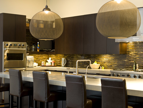
We don't usually see pendants this large but in this space I think they work very well. It helps that they are transparent. The choice of oversized pendants seems to be on the rise lately.
You will often see a small decorative mirror over a bed, but it rarely works to best effect. I would choose a round mirror for this beautiful room and I quite like the gold finish. I think it needs to be a tad larger. Rule of thumb is 2/3 the width of the headboard. Where this space is banked by two windows
you could go a tad smaller that that but not as little as half which is what we have in the room above.
When you have a very tall headboard or posts you need to scale up your lamp accordingly. I want this lamp to have a larger base and only slightly more height. It needs more presence. Everything else about this space is just lovely.
I love the burlap with stripe and the glass base of this lamp, but it gives that uncomfortable feeling again. How do you know which shade size (height and width) to choose for a lamp? There are all kinds of formulas for this, but consider a shade that is roughly 2/3 the height of the lamp base up to where the socket begins and twice the width of the base. The shade above is not too bad height wise, but it needs to have a much larger shade diameter.
I seem to have a lot of lamp issues in this post. Great lamp but not on this cabinet and what about placing the little plant next to it? This lamp needs SPACE!
Another lovely space with pristine white everywhere. If this table doubles as a place to eat, I guess function will outweigh form. Otherwise a coffee table should be roughly 2/3 the length of the sofa.

In my world you should not have to reach up to a coffee table or any table for that matter. It is actually dangerous if you have a hot drink and knock it enroute. A coffee table is usually the height of the sofa cushion, a tad lower or higher. Modern coffee tables are often much lower than the top of the sofa cushion.
The floral arrangement is also very high for the middle of a space. Safety again. There's living in a space and then there are photo shoots. Not the same thing at all.
This may only be a pet peeve of mine because I see tall tables next to seating in home decor magazines and online.This smallish love seat with delicate arms is overpowered by this much taller table. It might not be quite so bad if the lamp weren't towering over everything.
I can't imagine why one would want an art work touching the ceiling and a sofa. I guess the designer could be making some statement about insignificance!


Tidak ada komentar:
Posting Komentar