Salmony orange with charcoal gray can be extremely elegant and contemporary. Many Turkish rugs use salmon as one of the main colours which makes this a timeless colour.
You can put any colour with black and white and it looks stunning.
And with white and soft gray this version of orange is positively fresh.
If you like something a little more restful consider muted oranges with earth tones ...
I would mix these colours with an cream walls but the blue works well too. Colour is such a personal thing; I never want to see too many colours in a room where I want a restful look.
A crisp look with a salmon /tangerine combination.
And for a girl's bedroom mix it with a pale aqua.
or with true blue and white in a living room...
or even with a muted purple in a bedroom or nursery.
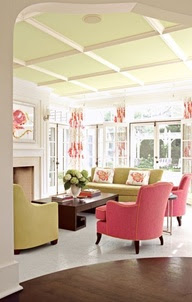
But I'm trying to warm up to mixing it with greens. Too many memories there ....
But I'm trying to warm up to mixing it with greens. Too many memories there ....
especially this particular green
I'm perfectly fine with it in a kid's room.... and a few hints of magenta would liven it up and make it more current.
This green is a fresh spring green mixed with lots of lights and the salmon is deeper so it gets my nod.
Would you use coral/salmon/peach in your home?
All links to images can be found on my Pinterest board for Colour scheme inspiration.


Tidak ada komentar:
Posting Komentar